Introduction
In this post, I will show you how to make an expandable text that is controlled by a button below it using Jetpack Compose. Additionally, we’ll introduce some simple animations to make the text state changes a bit nicer and add an ellipsis at the end of the text to indicate that it has overflowed.
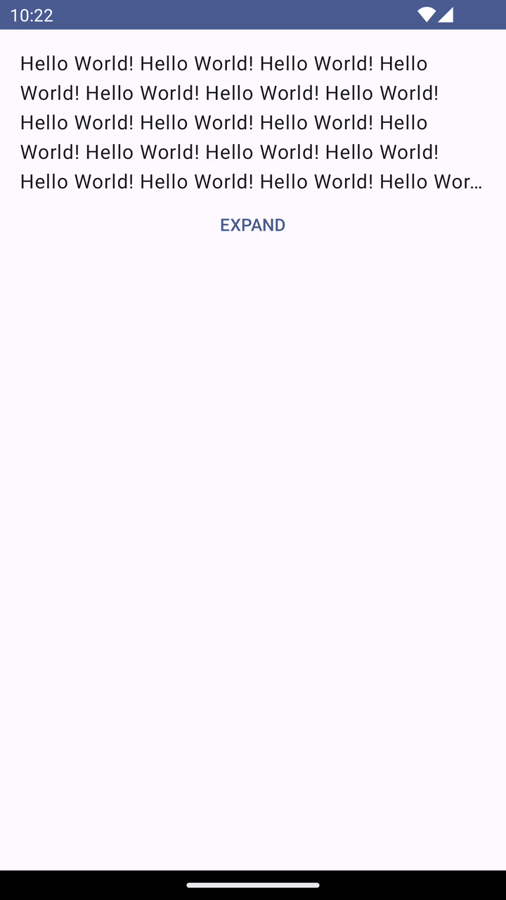
That’s the final result we’ll be implementing:
Solution
Let’s start with the following snippet and build on top of it:
class MainActivity : ComponentActivity() {
    override fun onCreate(savedInstanceState: Bundle?) {
        super.onCreate(savedInstanceState)

        setContent {
            MyAppTheme {
                Surface(
                    modifier = Modifier.fillMaxSize(),
                    color = MaterialTheme.colorScheme.background
                ) {
                    ExpandableText(
                        modifier = Modifier.padding(16.dp)
                    )
                }
            }
        }
    }
You get that snippet after creating a new project using Android Studio’s project wizard. The only change I introduced is that I added the ExpandableText composable that we’ll be building.
First, let’s add a Text and TextButton composables (wrapped in a Column) inside our new ExpandableText composable:
@Composable
private fun ExpandableText(modifier: Modifier) {
    Column(
        modifier = modifier
    ) {
        Text(
            text = "Hello World! ".repeat(50),
            maxLines = 5,
            overflow = TextOverflow.Ellipsis
        )

        TextButton(
            onClick = { },
            modifier = Modifier.fillMaxWidth(),
            shape = RectangleShape
        ) {
            Text(
                text = "Expand".uppercase()
            )
        }
    }
}
I am passing a modifier as a parameter to the ExpandableText to be able to control it from the outside.
Inside, I am setting the text to “Hello World! " repeated 50 times to make sure it overflows. Also, I’m limiting the number of lines to 5 and passing TextOverflow.Ellipsis to the overflow parameter to use an ellipsis when the text overflows (by default, it just clips the text).
The TextButton below is set to fill the entire width and has a RectangleShape because it looks more appropriate in this case than the default, rounded shape.
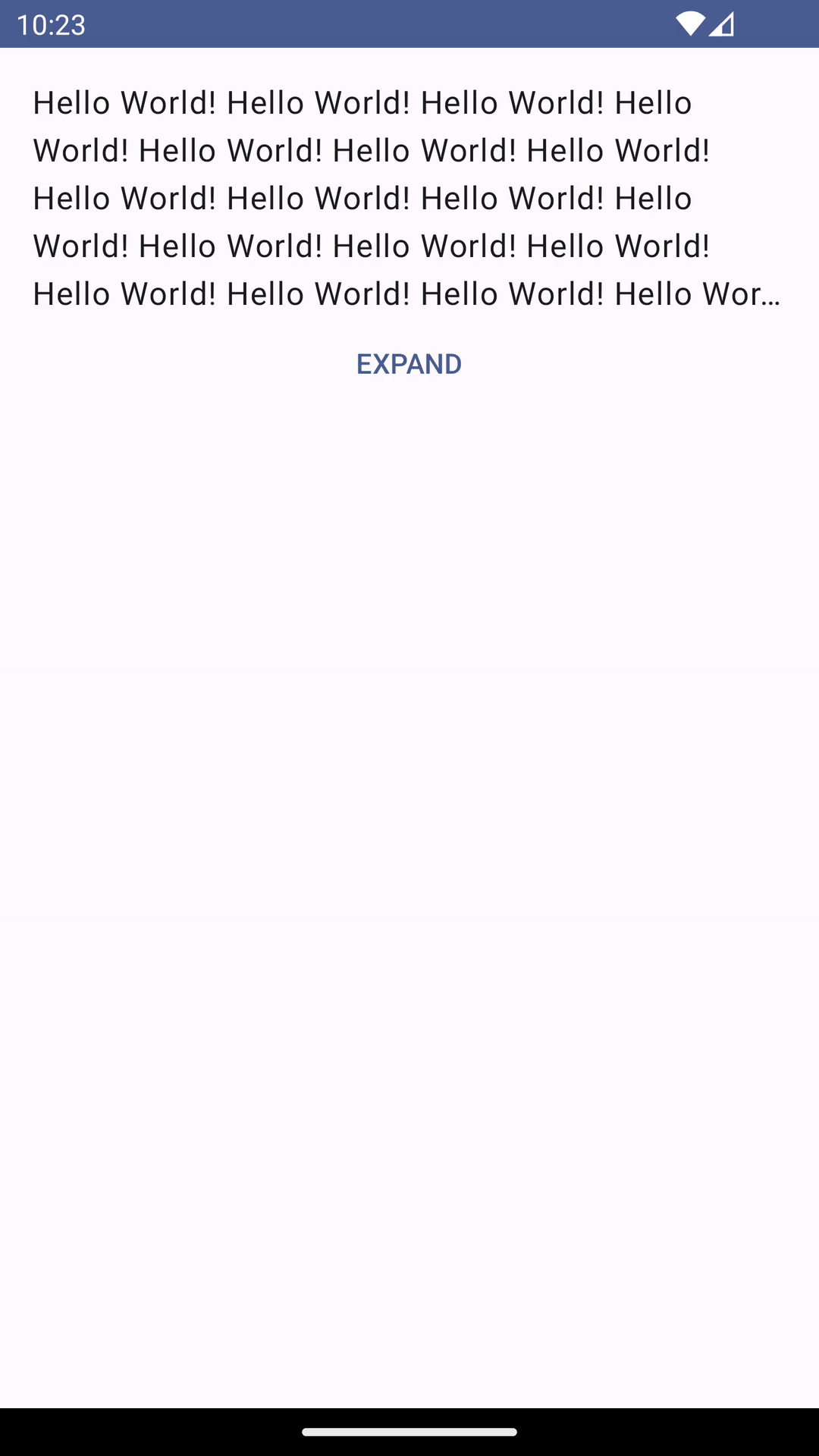
This is what we have so far:
Next, let’s implement the onClick for our TextButton. When clicking, we want to remove the limit of 5 lines for the text (so that it expands) and change the text for the button from “Expand” to “Collapse”.
For that, we will introduce a mutable state variable called isExpanded that will be toggled inside the onClick and control the parameters mentioned above like this:
@Composable
private fun ExpandableText(modifier: Modifier) {
    var isExpanded by remember { mutableStateOf(false) }

    // ...
    Text(
        // ...
        maxLines = if (isExpanded) Int.MAX_VALUE else 5,
    )

    TextButton(
        // ...
        onClick = { isExpanded = !isExpanded },
    ) {
        Text(
            text = (if (isExpanded) "Collapse" else "Expand").uppercase()
        )
    }
}
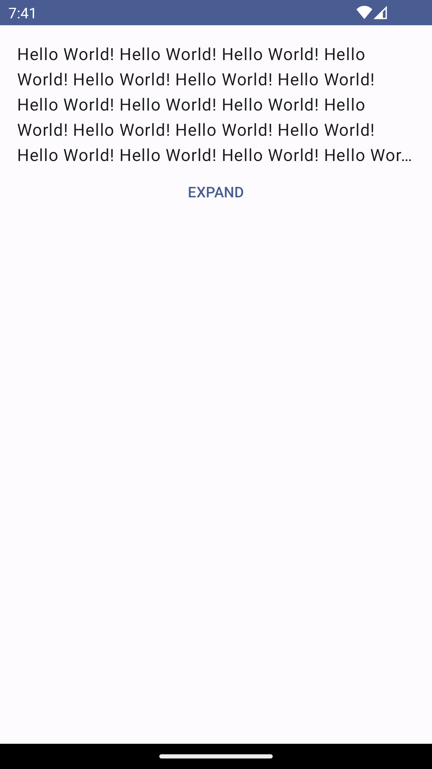
After those changes, expanding and collapsing works properly:
But there is one problem with our implementation. What happens when the text is shorter than 5 lines?
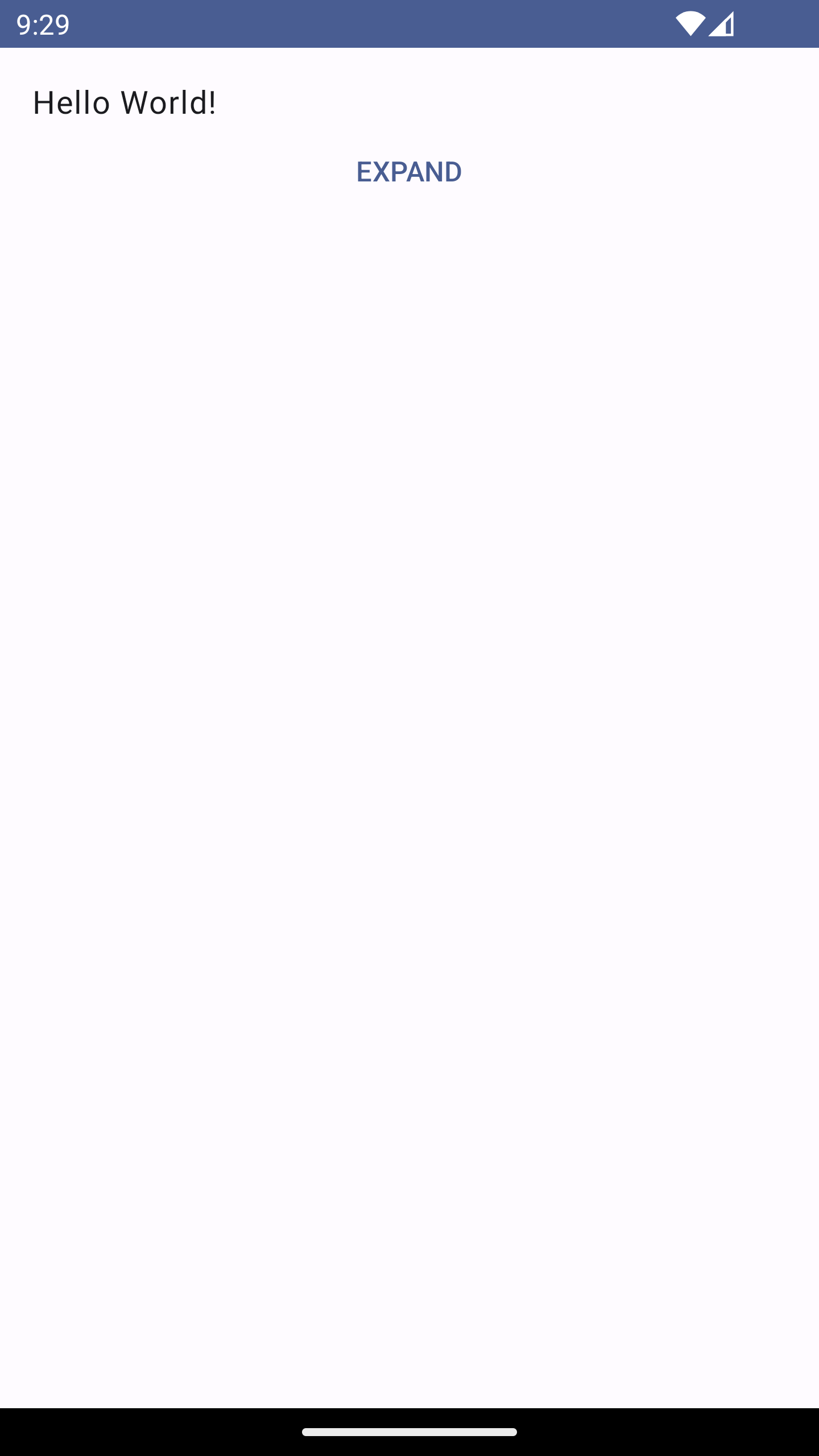
We don’t want to show the button when the text has not overflowed. To solve this, we need to find a way to be notified when the overflow happens and store it as a state.
Luckily, with Compose, it’s easy to do. The Text composable exposes a onTextLayout parameter which is a callback that is executed when a new text layout is calculated. That callback will receive a TextLayoutResult object, from which we will be able to get all the necessary information:
@Composable
private fun ExpandableText(modifier: Modifier) {
    var textLayoutResult by remember { mutableStateOf<TextLayoutResult?>(null) }
    val isExpandable by remember { derivedStateOf { textLayoutResult?.didOverflowHeight ?: false } }

    // ...
    Text(
        // ...
        onTextLayout = { textLayoutResult = it }
    )
}
We pass a lambda to the onTextLayout parameter, which will save a new TextLayoutResult object every time it changes into our textLayoutResult state.
Additionally, we define a derived state called isExpandable that will be recalculated every time the textLayoutResult?.didOverflowHeight changes. When it returns true, it means the text occupies more than 5 lines.
We used derived state here because the
isExpandableis never modified on its own. This state is always calculated based on the value of thetextLayoutResultstate. To learn more about derived states, check the documentation.
Now, since we know when the text overflows, we can add another derived state that will control the visibility of the button:
@Composable
private fun ExpandableText(modifier: Modifier) {
    val isButtonShown by remember { derivedStateOf { isExpandable || isExpanded } }

    // ...
    if (isButtonShown) {
        TextButton(
            // ...
        ) {
            // ...
        }
    }
}
This logic basically means that we only want to show the button when the text has overflowed (to be able to expand it) or when it’s already expanded (to be able to collapse it).
Finally, the only thing that’s missing is the animation, which we can add using a single modifier on our Text - animateContentSize():
@Composable
private fun ExpandableText(modifier: Modifier) {
    // ...
    Text(
        // ...
        modifier = Modifier.animateContentSize(),
    )
}
And with that change, we get the desired effect after running the app!
Here’s the full code:
class MainActivity : ComponentActivity() {
    override fun onCreate(savedInstanceState: Bundle?) {
        super.onCreate(savedInstanceState)

        setContent {
            ExpandableTextTheme {
                Surface(
                    modifier = Modifier.fillMaxSize(),
                    color = MaterialTheme.colorScheme.background
                ) {
                    ExpandableText(
                        modifier = Modifier.padding(16.dp)
                    )
                }
            }
        }
    }
}

@Composable
private fun ExpandableText(modifier: Modifier) {
    var textLayoutResult by remember { mutableStateOf<TextLayoutResult?>(null) }
    val isExpandable by remember { derivedStateOf { textLayoutResult?.didOverflowHeight ?: false } }
    var isExpanded by remember { mutableStateOf(false) }
    val isButtonShown by remember { derivedStateOf { isExpandable || isExpanded } }

    Column(
        modifier = modifier
    ) {
        Text(
            text = "Hello World! ".repeat(50),
            modifier = Modifier.animateContentSize(),
            maxLines = if (isExpanded) Int.MAX_VALUE else 5,
            overflow = TextOverflow.Ellipsis,
            onTextLayout = { textLayoutResult = it }
        )

        if (isButtonShown) {
            TextButton(
                onClick = { isExpanded = !isExpanded },
                modifier = Modifier.fillMaxWidth(),
                shape = RectangleShape
            ) {
                Text(
                    text = (if (isExpanded) "Collapse" else "Expand").uppercase()
                )
            }
        }
    }
}
Summary
That’s it for this post. I hope you found it helpful and learned something from it. If you have any questions, feel free to leave a comment here or reach out to me on Twitter.