Introduction
Recently, when working on an iOS app, I had to adjust the UI to work correctly with increased font size.
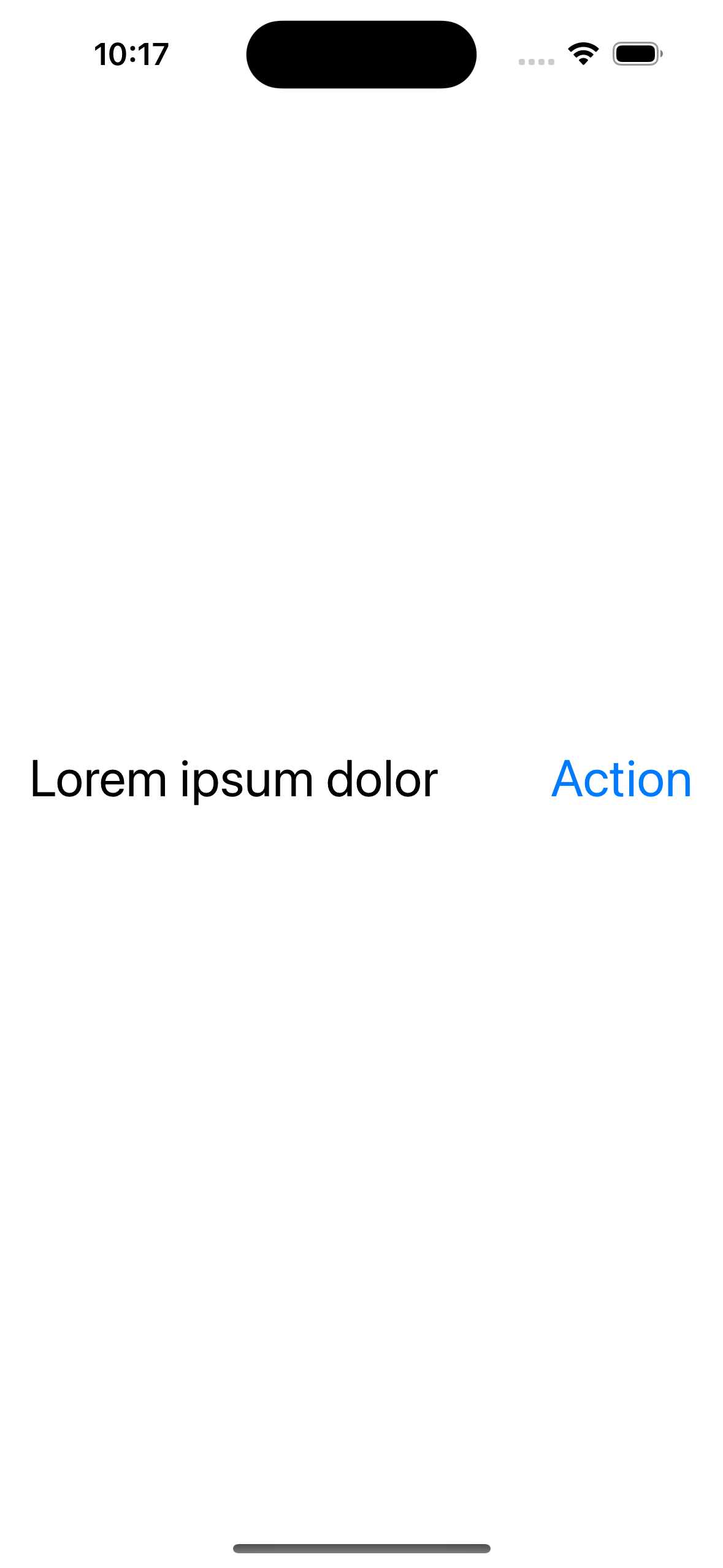
I had a UIStackView with its children laid horizontally - a UILabel and a UIButton. This is what the UI looked like:
And this is the code representing the stack and its elements:
private lazy var stackView: UIStackView = {
    let stackView = UIStackView()
    stackView.spacing = 16.0
    stackView.distribution = .equalSpacing
    stackView.translatesAutoresizingMaskIntoConstraints = false
    return stackView
}()

private lazy var label: UILabel = {
    let label = UILabel()
    label.text = "Lorem ipsum dolor"
    label.font = UIFont.preferredFont(forTextStyle: .body)
    label.adjustsFontForContentSizeCategory = true
    return label
}()

private lazy var button: UIButton = {
    let button = UIButton(type: .system)
    button.setTitle("Action", for: .normal)
    button.titleLabel?.font = UIFont.preferredFont(forTextStyle: .body)
    button.titleLabel?.adjustsFontForContentSizeCategory = true
    return button
}()
Right now, as we can see above, everything looks just fine. Both the label and button are fully visible. The problem appears when the user increases the font size in the system settings. We can easily emulate that using the simulator and the ⌥ ⌘ + shortcut while the app is launched:
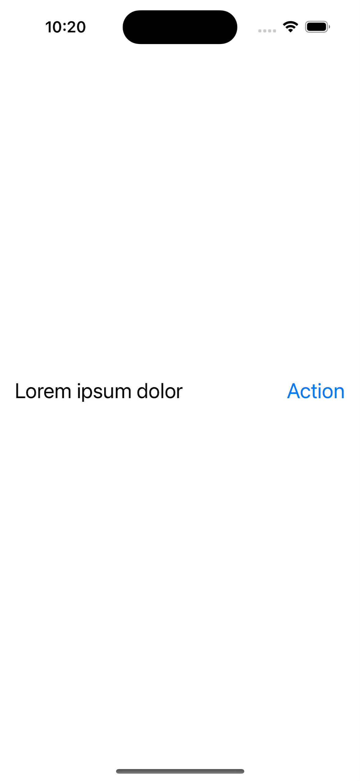
When both elements don’t fit horizontally, they are compressed more and more as we further increase the font size. Ultimately, the button’s title disappears entirely, and we only see the three dots. Far from a good user experience, right?
Ideally, we would like to display the elements vertically when they no longer fit horizontally. Luckily, changing the axis of a UIStackView is trivial. It’s enough to modify a single property (stackView.axis = .vertical).
But the challenge, however, is to trigger that change only when we detect that the label and button can’t fit our screen horizontally without being compressed. Otherwise, we still want them to remain in the same configuration if there’s enough space. Let’s see how we can do that.
Solution
The UIView contains a function we can override to solve our problem - layoutSubviews. The documentation says that
Subclasses can override this method as needed to perform more precise layout of their subviews.
In our case, a more precise layout is exactly what we need.
Generally, this function is called on a view every time layout changes occur. It includes situations like modifying the view’s bounds, changing the interface orientation, calling setNeedsLayout or layoutIfNeeded on a view, etc.
This also implies that layoutSubviews is going to be called when the user increases the font size, which is exactly what we want.
Here’s the code that we can put inside the layoutSubviews of our stack view’s parent to solve our problem:
override func layoutSubviews() {
    super.layoutSubviews()

    let maxWidth = bounds.width
    let labelWidth = label.sizeThatFits(frame.size).width
    let buttonWidth = button.sizeThatFits(frame.size).width
    let spacing = stackView.spacing

    let isHorizontal = maxWidth > labelWidth + buttonWidth + spacing

    stackView.axis = isHorizontal ? .horizontal : .vertical
    stackView.alignment = isHorizontal ? .firstBaseline : .leading
    stackView.invalidateIntrinsicContentSize()
}
At first glance, the code might look complicated, so let’s break it down.
Firstly, we determine whether the stack view should be horizontal or not. We do this by summing the widths of the label and button with the stack view’s spacing.
If that sum is less than or equal to the width of the stack view’s parent, it’s safe to make the stack view horizontal because the elements would fit appropriately without being compressed. In other cases, the stack view should be vertical.
We use
sizeThatFitsto calculate the size of a view. The documentation mentions that this method “asks the view to calculate and return the size that best fits the specified size”. In this case, we are passing the frame size of the stack view’s parent.
Additionally, we adjust the alignment so that in vertical mode, the elements are aligned to the leading edge of the screen and by first baseline in horizontal mode. Lastly, we call the invalidateIntrinsicContentSize to announce that the intrinsic size of our stack view has changed.
With those changes, we achieved the desired result:
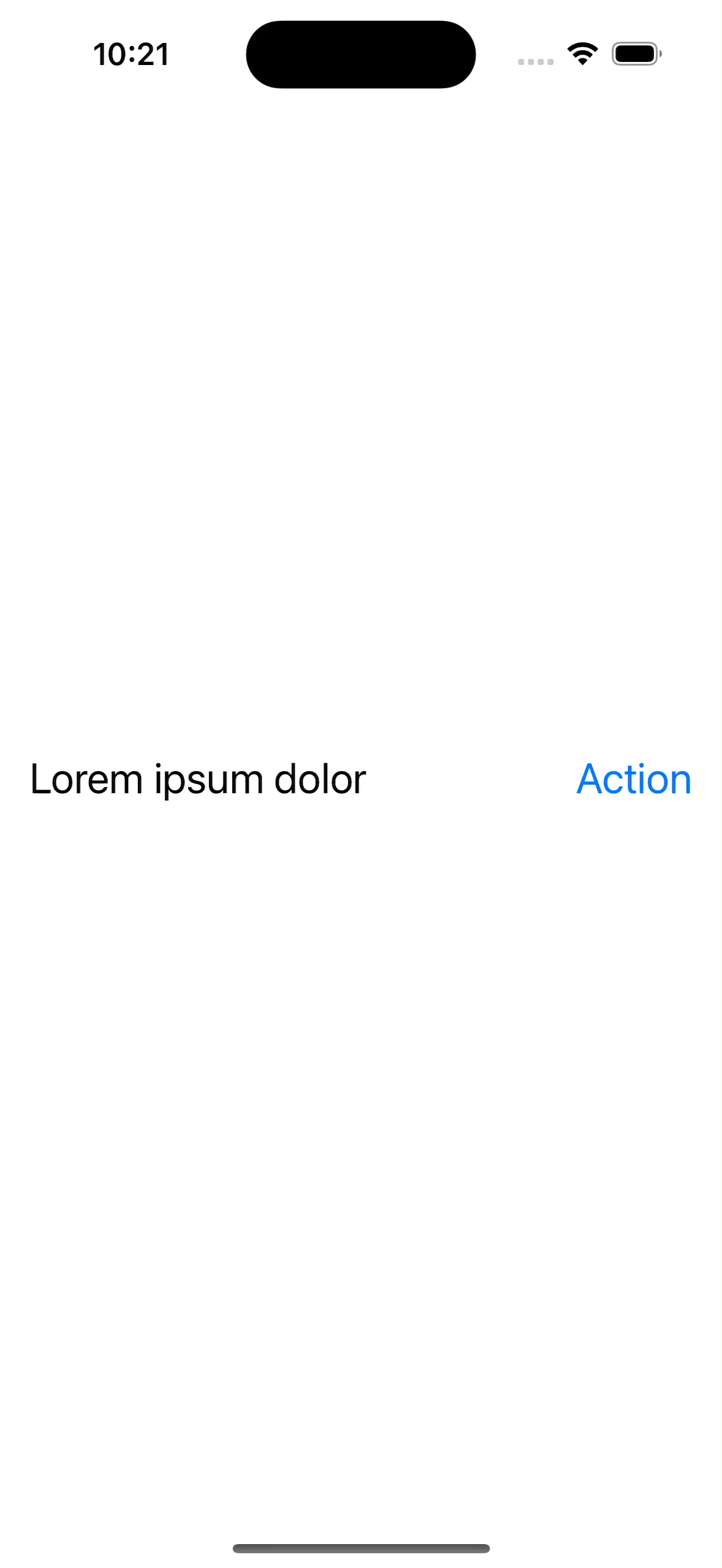
Initially, the elements are laid horizontally, same as before. Only when they would no longer fit entirely are they wrapped and displayed vertically.
Summary
I hope the solution presented here will make it easier for you to make your app more accessible, which I believe is crucial. If you’re interested, here’s a link to the entire source code of the application presented in this post.