Introduction
In this post, I would like to show you how you can draw content behind the system bars (status bar or navigation bar) when building a UI using Jetpack Compose.
A typical use case (that will be the focus of this post) is when you have an app bar or a navigation bar in your app and want to lay them out behind the system bars to achieve an effect of connectedness between system UI components and your app.
It can give your app a more compelling and modern user experience that adheres to the Material 3 guidelines.
Solution
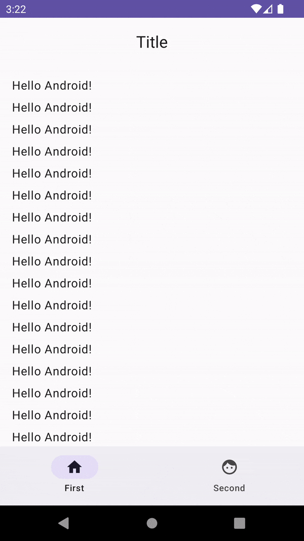
To illustrate all the necessary steps, we will start with a basic app that has a CenterAlignedTopAppBar, NavigationBar, and a LazyColumn containing some items.
I created the project using the Empty Compose Activity template from the Android Studio’s project wizard. The generated code will make the navigation bar black by default, while the status bar will use the primary color specified in the theme.
Here’s what the app looks like:
And here’s the code (without any irrelevant parts). Firstly, MainActivity:
class MainActivity : ComponentActivity() {
    override fun onCreate(savedInstanceState: Bundle?) {
        super.onCreate(savedInstanceState)

        setContent {
            App()
        }
    }
}

@OptIn(ExperimentalMaterial3Api::class)
@Composable
fun App() {
    AppTheme {
        val scrollBehavior = TopAppBarDefaults.pinnedScrollBehavior()

        Scaffold(
            topBar = {
                CenterAlignedTopAppBar(
                    title = { Text("Title") },
                    scrollBehavior = scrollBehavior
                )
            },
            bottomBar = {
                NavigationBar {
                    NavigationBarItem(
                        selected = true,
                        icon = { Icon(imageVector = Icons.Default.Home, contentDescription = "") },
                        label = { Text("First") },
                        onClick = { }
                    )
                    NavigationBarItem(
                        selected = false,
                        icon = { Icon(imageVector = Icons.Default.Face, contentDescription = "") },
                        label = { Text("Second") },
                        onClick = { }
                    )
                }
            }
        ) { paddingValues ->
            Surface(
                modifier = Modifier
                    .padding(paddingValues)
                    .fillMaxSize()
            ) {
                LazyColumn(
                    modifier = Modifier.nestedScroll(scrollBehavior.nestedScrollConnection),
                    contentPadding = PaddingValues(16.dp),
                    verticalArrangement = Arrangement.spacedBy(8.dp)
                ) {
                    items(count = 100) {
                        Text("Hello Android!")
                    }
                }
            }
        }
    }
}
And this is the body of the AppTheme function:
@Composable
fun AppTheme(
    darkTheme: Boolean = isSystemInDarkTheme(),
    dynamicColor: Boolean = true,
    content: @Composable () -> Unit
) {
    val colorScheme = when {
        dynamicColor && Build.VERSION.SDK_INT >= Build.VERSION_CODES.S -> {
            val context = LocalContext.current
            if (darkTheme) dynamicDarkColorScheme(context) else dynamicLightColorScheme(context)
        }
        darkTheme -> DarkColorScheme
        else -> LightColorScheme
    }

    val view = LocalView.current
    if (!view.isInEditMode) {
        SideEffect {
            val window = (view.context as Activity).window
            window.statusBarColor = colorScheme.primary.toArgb()
            WindowCompat.getInsetsController(window, view).isAppearanceLightStatusBars = darkTheme
        }
    }

    MaterialTheme(
        colorScheme = colorScheme,
        typography = Typography,
        content = content
    )
}
Notice the use of
val scrollBehavior = TopAppBarDefaults.pinnedScrollBehavior()at the beginning of theAppcomposable. Thanks to this, we get that nice visual effect of elevation on the app bar when scrolling the list.To utilize it, we first pass the created
scrollBehaviorto theCenterAlignedTopAppBar. Next, we attach itsnestedScrollConnectionto theModifier.nestedScrollon theLazyColumnthat will keep track of scroll events and notify the app bar about them.
As you can see above, the user interface in our sample app is far from perfect. The black color of the navigation bar doesn’t play nicely with our design. Also, no matter whether the app bar is elevated or not, the status bar has always the same color.
Ideally, we would like the system navigation bar to have the same color as our app’s navigation bar. The same goes for the status bar. It should change colors based on the app bar’s current elevation.
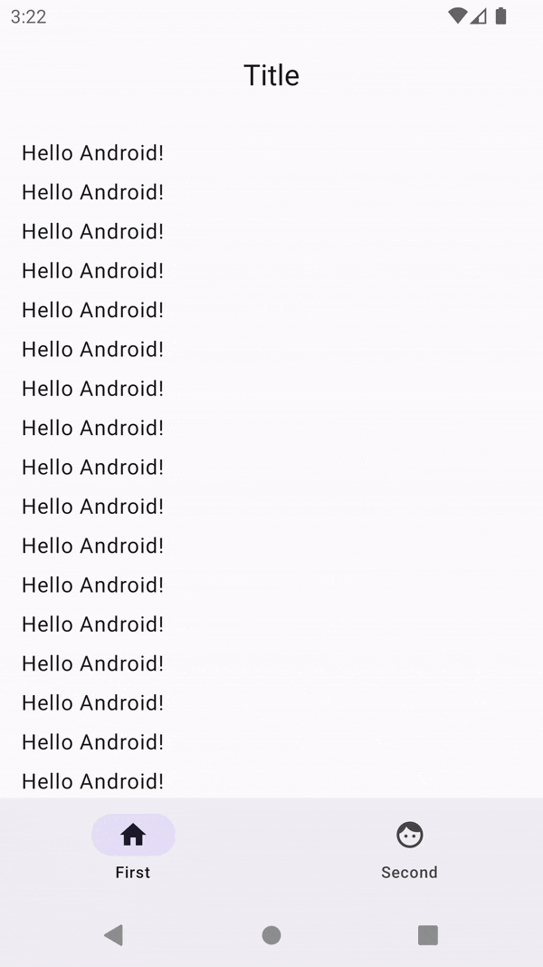
Here’s the final effect that we would like to achieve:
Luckily, it’s not that complicated. There are only two steps we need to introduce to our code presented above:
- Laying out our app in full screen.
- Changing the system bar colors and transparency.
Laying out our app in full screen
A single line of code is enough to make sure our app goes edge-to-edge and is laid out using the entire width and height of the display (including the system bars). We can place it inside the onCreate method in our activity:
override fun onCreate(savedInstanceState: Bundle?) {
    super.onCreate(savedInstanceState)

    // This will lay out our app behind the system bars
    WindowCompat.setDecorFitsSystemWindows(window, false)

    setContent {
        App()
    }
}
Changing the system bar colors and transparency
After drawing our content behind the system bars we need to make sure it’s visible to the user. We can do that by setting the color of the navigation bar and the status bar to transparent.
If you are interested, I wrote an entire post about changing the system bar colors in Compose.
Here is the relevant part of the AppTheme function:
SideEffect {
    val window = (view.context as Activity).window

    window.statusBarColor = Color.Transparent.toArgb()
    window.navigationBarColor = Color.Transparent.toArgb()

    if (Build.VERSION.SDK_INT >= Build.VERSION_CODES.Q) {
        window.isNavigationBarContrastEnforced = false
    }

    val windowsInsetsController = WindowCompat.getInsetsController(window, view)

    windowsInsetsController.isAppearanceLightStatusBars = !darkTheme
    windowsInsetsController.isAppearanceLightNavigationBars = !darkTheme
}
Firstly, we set the system bar colors to transparent. Next, we tell the system not to enforce the navigation bar contrast, because by default, on API >= 29, the system applies a translucent scrim behind the system bars. Lastly, we modify the icon colors to match the current theme (light or dark).
Now, after running the app, we get the desired effect and our app looks much better!
Notice that even though we draw our app bar and navigation bar behind the system bars, their content (titles, icons, etc.) doesn’t interfere with the system bars. That’s because since version 1.0.0-beta01 of the androidx.compose.material3:material3, these components handle insets automatically and apply correct padding values based on them.
If we used previous versions, we would have to do it manually. If you are interested in how it used to be done, here is the commit from the Now in Android project that removes manual insets handling after bumping the library version.
Summary
I hope this post will save you some time when you try to draw some UI components behind the system bars.
If you have any questions or comments, feel free to reach me on Twitter.