Introduction
In this post, I would like to show you how you can change the status bar and navigation bar colors using Compose, without having to modify any XML files.
Before Jetpack Compose, to specify the bar colors, we would traditionally modify the themes.xml file like this:
<resources>
    <style name="Theme.BarColors" parent="android:Theme.Material.Light.NoActionBar">
        <item name="android:statusBarColor">@color/purple_700</item>
        <item name="android:navigationBarColor">@color/purple_700</item>
    </style>
</resources>
As you can guess, the android:statusBarColor and android:navigationBarColor attributes affect the status bar color and navigation bar color, respectively.
Additionally, we could specify android:windowLightStatusBar (to make the icons on the status bar dark) or android:windowLightNavigationBar (similarly for navigation bar). Unfortunately, the latter requires API level 27. It forces us to override this attribute in another themes.xml file under the values-27 folder. It can lead to quite a messy structure when we have a lot of attributes like this. It can get even worse when we decide to support a dark theme.
Luckily, with Compose, there is another way of doing this.
Solution
For this example, I created a simple screen using Compose that displays centered text on a Surface:
class MainActivity : ComponentActivity() {
    override fun onCreate(savedInstanceState: Bundle?) {
        super.onCreate(savedInstanceState)

        setContent {
            BarColorsTheme {
                Surface {
                    Text(
                        modifier = Modifier
                            .fillMaxSize()
                            .wrapContentHeight(),
                        textAlign = TextAlign.Center,
                        style = MaterialTheme.typography.h3,
                        text = "Hello Android!",
                    )
                }
            }
        }
    }
}
The BarColorsTheme (where BarColors is the name of the app) that wraps everything is a composable function that is created for you when you use the Empty Compose Activity template from the project wizard:
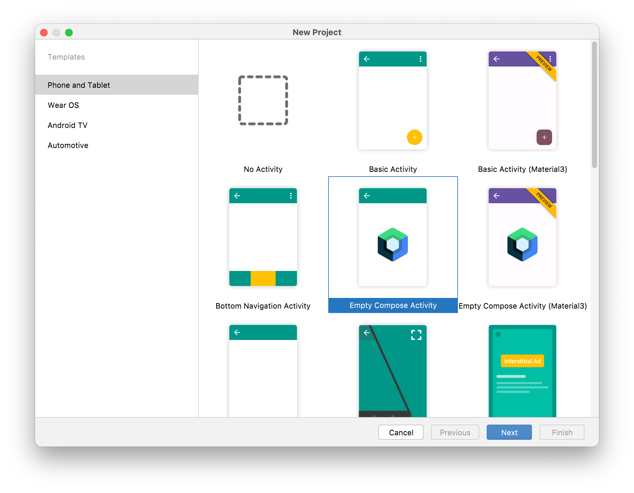
Android Studio’s new project wizard
This is what it looks like:
private val DarkColorPalette = darkColors(
    primary = Purple200,
    primaryVariant = Purple700,
    secondary = Teal200
)

private val LightColorPalette = lightColors(
    primary = Purple500,
    primaryVariant = Purple700,
    secondary = Teal200
)

@Composable
fun BarColorsTheme(darkTheme: Boolean = isSystemInDarkTheme(), content: @Composable () -> Unit) {
    val colors = if (darkTheme) {
        DarkColorPalette
    } else {
        LightColorPalette
    }

    MaterialTheme(
        colors = colors,
        typography = Typography,
        shapes = Shapes,
        content = content
    )
}
The BarColorsTheme serves as a root composable that specifies the proper color palette (based on whether the dark theme is enabled), typography, and shapes for the entire hierarchy.
Because it is a root composable in our app, we can use this place to specify the system bar colors. Here is how we can do that:
@Composable
fun BarColorsTheme(darkTheme: Boolean = isSystemInDarkTheme(), content: @Composable () -> Unit) {
    // ...
    val view = LocalView.current
    if (!view.isInEditMode) {
        SideEffect {
            val window = (view.context as Activity).window
            window.statusBarColor = colors.primary.toArgb()
            window.navigationBarColor = colors.primary.toArgb()

            WindowCompat.getInsetsController(window, view)
                .isAppearanceLightStatusBars = darkTheme
            WindowCompat.getInsetsController(window, view)
                .isAppearanceLightNavigationBars = darkTheme
        }
    }
    // ...
}
We use the window object associated with our activity and modify the appropriate properties - statusBarColor and navigationBarColor. We use a primary color from the current palette (in this case it’s a shade of purple).
Additionally, we use WindowCompat to make the status bar and navigation bar icons light or dark, depending on the value of the darkTheme variable. A nice benefit of using WindowCompat is that we don’t have to check the API level before executing those methods. Behind the scenes, they will have no effect on unsupported APIs.
After making those changes and running the app, we get the desired effect:

System bar colors changed with Compose
Notice the use of SideEffect here. A SideEffect runs after every recomposition. Thanks to this, the system bar colors will be automatically updated to correct values when a user enables the dark theme, without having to reopen the app:

System bar colors adapting to the current theme
Summary
With Jetpack Compose, specifying system bar colors that adapt to the current theme is quite simple. All of the relevant code sits in one place. We no longer have to create different themes.xml files and override specific attributes.
I hope you found this post interesting. If you have any questions, feel free to reach me on Twitter.